Bully illustration (part 3)

So continuing on from the last post… The men’s style “bully illustration”
I start putting the watercolour on. I tend to work one area at a time and stared with the little boys face, then on to those hammers. I work in layers working usually from light to dark.
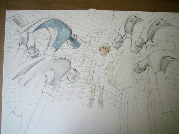
Watercolour in progress, bully illustration
Then working up the hammers. I know there is going to be some graffiti in the background to echo those angles from the hammers so I’m not worried about them getting to dark.

Finally the graffiti and the brick work which i did with a wash then cut in the lines with a scalpel to get highlights.

54 thoughts on “Bully illustration (part 3)

  1. i too, enjoy your sharing of process.
    in my day job i get to do one illo a week. i often find out about what the editor wants before the story is assigned. i then pester the writer for his/her lede from which i can get a visual metaphor. used to have time –now i have about 3-4 hrs over 2-3 shifts to get it done–to pencil several ideas out to show but now i just jabber them to the ed. and the writer and go with the one that is least disliked. often the writer has a change of mind so the drawing and the story don’t match. such is life. anyway they still let me draw.
    my bully drawing was that of a big shadow darkening a scared kid, the shadow and the kid were the same shape.
    i teach a digital–photoshop and ilustrator–drawing class. i explain the ukiyo-e process and give them a project like it. it relates more to what it is like to day than what the europeans were doing then. i like being thusly retro but not so much as to miss ulano blue.

  2. HL BISE

    One of my teens was bullied, a few months ago; so (outside of your true talent) I like the way you’ve cornered the subject, adding the hammers—seems to be show the way my daughter was feeling on the inside. Displaying your work and thought processes here is captivating, to me. Good Stuff! Thanks for posting (and congrats on FP!).

  3. Great work! You are an expert in watercolor!

    I did some illustration by water color pencil, and just want to ask you about your comment on watercolor pencil vs. water color.
    What do you think? Is there a great difference?
    I see your work shows layers of brilliant colors and I wonder if I can do it by water color pencil. Any suggestions on that?

  4. That’s coming along great!
    Reminds me of those terrifying marching hammers in that Pink Floyd film.
    I liked this so much that I’m now following you on twitter.
    Hello!

  5. I’ve never really used watercolour before, any attempt I had turned out a bit wrong but seeing how you have done it makes sense and points out where I have been going wrong, going from light to dark…I’m going to give this method a try! Thanks! Love the illustration and the methodology! Congrats on being FP’d! 🙂

  6. Very cool. It’s always so awesome to see the full artistic process. If you ever happen to be showing in galleries you should definitely post these images alongside the final copies!

  7. i love watching your creative process – i have tried to do something similar on my blog. for me i like to have a record of the various stages.. great work, great blog!

  8. The illustration is indeed very creative and innovative. It was a pleasure identifying with the illustration. Too good and no words can describe your skill at it. Keep it up!!!

  9. Pingback: Bully illustration (part 3) (via Watercolour illustrator | screenprinter | Daniel Mackie) « fishballqiaohao

  10. Pingback: edison and his concrete houses, cinema wallpaper, a defense of the f-word « inkbluesky

  11. Pingback: Bully illustration (part 3) (via Watercolour illustrator | screenprinter | Daniel Mackie) « My personal Blog

Leave a reply to endlesscrossroads Cancel reply